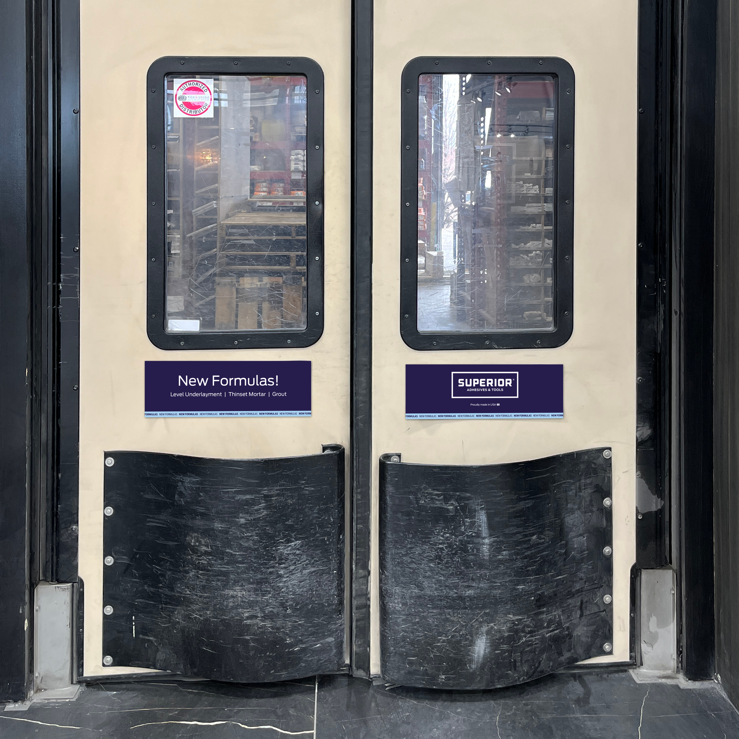
New Superior Formulas Launch
This project focused on designing a series of in-store graphics for the brand Superior to spotlight its new product formula and core benefits.
Bold Graphics, Clear Messaging
I began by identifying the product’s standout benefits and translating them into a clear visual language through custom-designed icons. A bold color palette and clean, modern typography were chosen to ensure strong readability and brand alignment. I worked closely with our print partners to select a substrate that could withstand handling while maintaining high print quality.